
Turning a Fixed Width Site to Variable Width Using Web Technology
I love my Y50. The 4k screen resolution gives me both a chance to see a lot more on a single page and much better and crisper text if I want to see it normal size. The only downside? Software that assumes pixel sizes.
It doesn’t really matter what I am looking at: anything that comes with predefined pixels turns into a microscopic smudge. It’s completely impossible to realize what the buttons do in the Gimp, for instance. Checkboxes are so small, it’s virtually impossible to tell whether they are checked or not.
I can deal with everything else, though. The one thing that is an eternal pain is the web. In particular: sites that define their content in pixels.
User interface design has always been caught between two extremes: on one side, the desire to make everything predictable by forcing it to look exactly as it looks on the designer’s screen; on the other, the desire to make everything work universally on all screens. The former is epitomized by PDF and iOS; the latter by HTML and … the Web.
A PDF document is many things. Most importantly, though, it’s a blob that looks the same no matter where you are and how you look at it. The part where it looks the same everywhere is very useful in certain cases – like if you want to shuttle an official document around, or if you need to ensure that elements don’t get moved out of place.
A PDF document will look weird, though, if you try to look at it on certain devices. You may have to scroll sideways, you may have to zoom in and out all the time, you may have to switch orientation on your device to make the viewing area acceptable.
A web document, on the other hand, doesn’t guarantee a specific look. It guarantees certain basic things: legibility, formatting, relative sizes. But if you want to lay out a particular page, you’ll find it hard. Images may float somewhere unexpected, buttons may look out of place, and elements that are conceptually the same may end up having different look and size.
To address the disparity, for a while web developers used to create sites that assumed a specific browser. That was both a particular browser vendor and version (e.g. Internet Explorer 7) and a particular screen size. That worked for a while (early 2000s) but fell apart as soon as the first modern smartphones (i.e. iPhone) showed up. Suddenly, you had a different browser with a completely different screen size to deal with.
Designers dealt with it in a panicked way: they created mobile sites. Since it was a panic reaction, they made a huge mistake: differences in content, features, and functionality between the desktop and mobile version. Mobile users ended up hating that, because their browsers could do the same as the desktops.
Then came reactive design: web sites were built around the content, and the functionality flowed around the available screen, rearranging itself based on what the current browser displayed. That was particularly useful, because web sites would have to react to changes within the single session, if a user changed from portrait to landscape and vice-versa.
But that move is slow. Many web sites (including this one) are still mired in fixed width designs. They work, but they are a pain. In particular, they may force you to look at a site from a small viewport/display, but the site is meant for a much larger browser. More commonly, though, the browser will have a resolution that is much higher than the resolution for which the site was created.
In particular, there was a magic size when sites were designed in fixed width: 1024 pixels. A lot of screens maxed out there, back in the day, and we are stuck with the 1k paradigm for the time being.
The problems with fixed width sites, though, don’t end at scrolling and having to deal with tiny viewports. There is also the problem of fonts that don’t fit the assigned elements. Sometimes that just looks odd, but sometimes functionality is hidden.
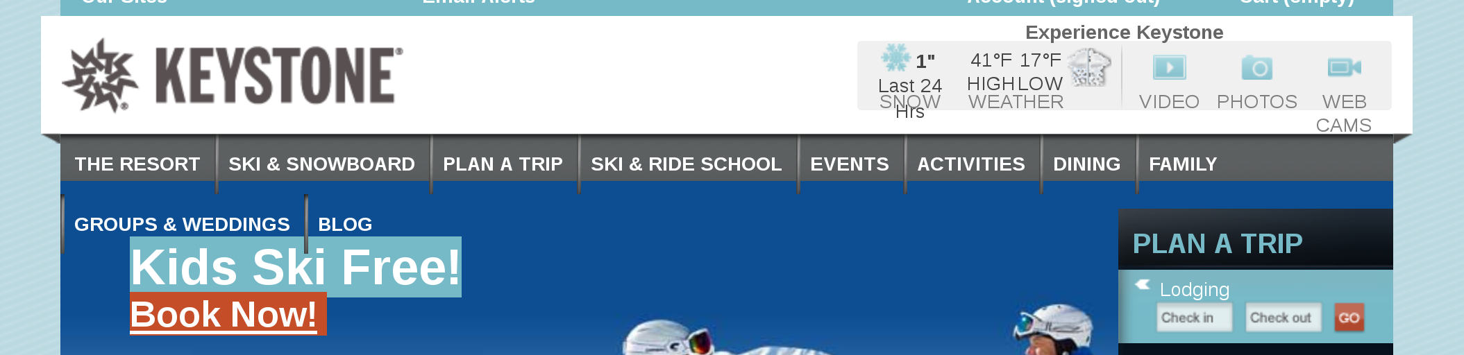
Here an example: I am a proud season pass owner at Keystone Resort in Colorado. When I go (went) to the web site, this is what I saw:
What’s the problem? See how below THE RESORT there is a GROUPS & WEDDINGS link? No, the problem is not that I want to get married in Colorado, the problem is that when I go to THE RESORT, a menu pops down. If I try to click on any of its items, the browser thinks I mean GROUPS & WEDDINGS and shows me the corresponding menu.
Incidentally, since it’s a fixed width design at the 1k level, three quarters of my browser page are the same baby blue as the left and right of the image above, with nothing in them. I could live with that. I can also live with the fixed width design – except when it comes to the menu. I want to be able to click on the links.
So, what did I do? I installed a nifty Firefox extension that also exists for Chrome, Stylish. Stylish allows you to override the treatment for any element on a web site, and allows you to be both very specific and very general.
Technically, Stylish allows you to override the style sheet for any element, element class, or element type. You can do this on a particular page, on a prefix, on a whole site, or even on randomly picked subsets of pages. It’s all very powerful, which sounds complicated. But it isn’t.
To change the appearance of an element, you first need to know it’s name. In style sheet speak, you need the correct selector. How do you find that? You could go by the page source, but that’s a humongous pain in the keister. The other option is to install a different extension that makes the selection process easier. I picked Web Developer for that purpose.
Once you install Web Developer, you can access the CSS menu (where CSS stands for Cascading Style Sheet). There you want the Display CSS option, which you can also access from the shortcut Shift+Alt+Y. A section of the browser window opens at the bottom, and Web Developer waits for you to click on something.
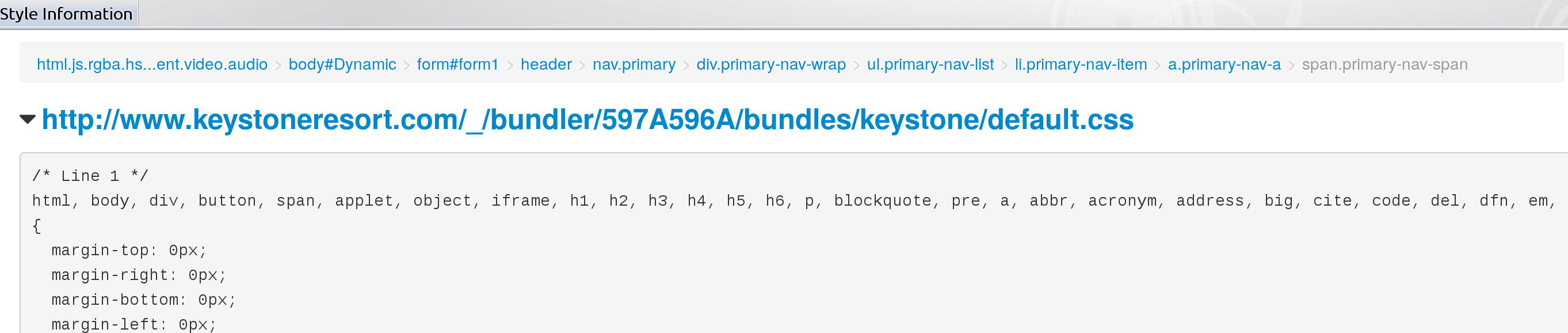 In the case of the Keystone page, I just clicked on one of the menu items. I was presented with a long list of style options. You want to look for one that says, “width:” and something in pixels. There was nothing of the sort. (see image)
At the top of the screen, you’ll notice a weird series of words. They are called breadcrumbs and reference the logical location of the element you clicked at on the page. In this case, it starts with html.hs.rgba… and ends with span.primary-nav-span.
Now you click on the breadcrumbs starting from the right, until you hit one that says, “width: xxx px;” In our case, that.s the one that says div.primary-nav-wrap. It unsurprisingly says: “width: 960px;”
What do you have to do? You have to override that instruction. How do you do that? You go to the web site (keystoneresort.com) and click on the Stylish icon on the toolbar. There, you select Write New Style > For This URL. You get a window that looks something like this:
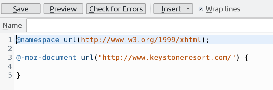
Enter a name (something like “Keystone Variable Width Menu”). Then you simply add the following into the curly brackets:
div.primary-nav-wrap {
width: auto;
}
That doesn’t look too complicated, does it? We specify who the instruction applies to (div.primary-nav-wrap). Then we say what the instruction is: the width is to be automatically determined. You could have said the width should be simply larger – 1200px, for instance. Or you could have specified the width in percentage of the page, 100%. All good options. As soon as you save, the style is applied, and you see the results. In my case, with width set to auto, I get this:
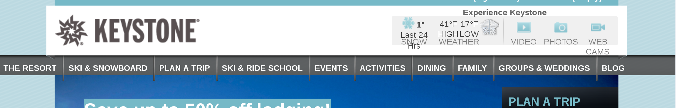
As you see, the menu overflows both left and right. It works for me – I don’t really care about looks if the functionality is right. The good thing: once it’s saved, the new style sheet override is available every time you go back to the same site!
I mentioned that this blog’s template, too, has fixed width. I got annoyed by it, so instead of doing the logical thing (change the template?), I cheated with this trick. My new Stylish sheet looks like this:
#header {
width: auto;
}
#navr {
width: auto;
}
#leftbar-w {
width: 20%;
}
#centercontent_md {
width: 79%;
}
#wrapper {
width: auto;
}
#bottom {
width: auto;
}
What’s that? you ask. Why are there # signs here? Turns out that CSS is a science of complexity. The way you specify what you mean is manyfold. You can specify an instruction by element type – like “img” for an image, or “p” for a paragraph. You can specify an instruction per ID by prefixing the ID with a dot. We did that above, for the div with element ID primary-nav-wrap.
This last way to specify elements is by class. While element type is given by HTML and ID is unique (you can’t have a given ID more than once), classes allow you to group similar elements together. You can give an element as many classes as you like or need, and you can give the same class to as many elements as you want.
In this case, we have e.g. the header class. It is specified on the page as being of a specific width, and I overrode this. In the middle section, I have a left side and a right side. I decided to make them about 20/80, as you can see above (the 1% difference comes from fixed width padding).
Interestingly, that’s all it took to make the page look right. Since i have access to the template, I can simply go in there and make the changes right in the file. Why don’t I do that? Because I don’t know what other pages on my site might look weird if I change the template. I would have to go out and test at least the major sections, and right now I am too lazy.
But, if you want to transition your site from fixed width to variable width without changing the template dramatically, that’s probably a good approach: instead of setting up a staging area, just use Stylish. Once you have the set of stylesheet changes you need, you can then put them into your original template and have great confidence everything will look right.
Last item: why would a site not look right in variowidth? Mostly because some of its elements are inherently pixel-based. For instance, you could have a content background image that looks weird if repeated. Or you could have a border image that can’t be stretched.
Whatever it is, you really should think about getting rid of those elements. You can use “flat design” as an excuse, no matter how ugly and hard to read flat designs are.