
Python, Matplotlib, and Surf Reports
 It took me a long while to fall in love with Python (the language). It was mostly because the features I ended up liking were hidden behind the giant flaw in the foreground: mandatory matching white space. That means that, unlike in most other programming languages, Python decides that two lines belong together if they are preceded by exactly the same white space. If the white space doesn’t match, Python complains.
I won’t go into details here. Suffice to say that I ended up loving what lies beyond that fatal flaw. The Python developers created an environment where things are easy, and expected. Python tries to do what’s intuitive most of the time, and that makes it so much easier to work with.
So I decided to use it instead of my old staple, Tcl. Tcl was really marvelous in certain aspects, but it had gotten little love lately. Tk, its GUI, was once the gold standard of graphical user interface scripting, but it looks dated and weird now. So I started porting all my old scripts from Tcl to Python, to see how much time it would take and if they’d get longer or shorter.
What do you know, programming was a breeze. Python has libraries for pretty much anything you could wish, sometimes it’s a bewildering amount of choices. So all my scripts ended up being significantly shorter, faster, and easier to read.
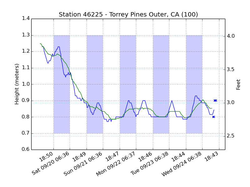
Once I was done with my scripts, I started looking for a new challenge. I came up with the idea of taking the NOAA chart for the Torrey Pines buoy and making it look better and more informative.
 Here is the original chart. Notice how wave heights are simply plotted without averaging out anything. That’s very confusing and doesn’t give a good picture of the current waves – especially because the data is accurate only to 10 cm and the jump from one level to the next is quite high.
So I thought I could do better. I decided I would create a graph with configurable memory that would average waves out, so that I’d get a smoother picture of what’s happening. To do so, I’d have to figure out how to get the data, and what kind of data visualization was offered in the Pythonic world.
1. Getting the Data
The NOAA (National Oceanic and Atmospheric Administration) publishes its buoy data in publicly available format on http://www.ndbc.noaa.gov. From the main page, you’ll find a buoy locator that leads to the page for a particular buoy. From there you can get the data for the past 45 days. Slight overkill, but more data than needed is better than too little to use.
The file looks like this:
#YY MM DD hh mm WDIR WSPD GST WVHT DPD APD MWD PRES ATMP WTMP DEWP VIS PTDY TIDE #yr mo dy hr mn degT m/s m/s m sec sec degT hPa degC degC degC nmi hPa ft 2014 09 25 00 06 MM MM MM 0.9 14 5.0 198 MM MM 22.3 MM MM MM MM
As you can see, the first two lines are simply describing the format of the data, and from the third on we get actual measurements. The file is pretty rich in information (that this particular buoy mostly doesn’t provide). The abbreviations are explained on the metadata page. For our purposes, all we need to know it the date and time (the first five fields) and the wave height (field WVHT, #9). Here we have a wave height of .9 meters, which is about 3 feet.
(Please also notice the water temperature, field WTMP: 22.3 degrees Celsius is 72.14 – we are boiling!)
2. Graphing the Data
I seriously thought this was going to be the harder part of the gig. I mean, you have to parse the fields, then figure out the averages, and finally put everything on an image. That’s bound to be painful, right?
Enter matplotlib, the magic math plotting library. It does all the work. I was entirely surprised at how easy it was. Seriously.
The problem with matplotlib is that it’s incredibly powerful, but the syntax is very, very strange. You have to get used to it, and it all makes sense once you are. Until then, it’s voodoo magic meet The Matrix.
3. Version 1.0
I’ll just dump the whole thing for your viewing pleasure: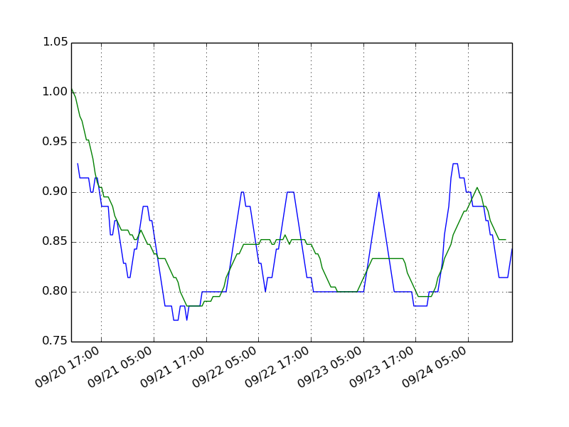
#!/usr/bin/python<br></br>import urllib
from dateutil.parser import parse
from dateutil import tz
from matplotlib.pyplot import *
from matplotlib import mlab, dates<br></br>data = urllib.urlretrieve('http://...')<br></br>``txt = open(data[0],'r').read()
lines = txt.split('\n')``` lines = lines[2:] times = [] heights = [] try: for line in lines: dt = parse(line[0:16].replace(’ ‘,’-’,2).replace(’ ‘,‘T’,1).replace(’ ‘,’:’)) ht = line.split()[8] times.append(dt) heights.append(float(ht)) except: pass fig, ax = subplots() ax.xaxis.set_major_formatter(dates.DateFormatter(’%m/%d %H:%M’, tz=tz.tzlocal())) fig.autofmt_xdate() i = 200 plot(times[3:i+3], mlab.movavg(heights, 7)[:i]) plot(times[6:i+6], mlab.movavg(heights, 21)[:i]) grid() savefig(‘waveplot.png’)`
What did I do here. It all starts with the magic line, “#!/usr/bin/python” that loads python and makes it run this script. Next we have a series of import statements, that tell Python what extra libraries we are going to use. That’s really important in Python, because so much of the work is done by different libraries.
The first line that actually does something is data=. That line uses the urllib library to retrieve (you guessed it) a URL. We give it the URL as argument (I left it out here, figure it by yourselves!) We get a file handle back, and can use the read() function to read the content.
We want to handle each line separately, so we use the split() function of the string object. \n is programming shorthand for “newline character”, so the line with split(‘\n’) means we get back a list of strings, one per line in the original file.
Since the first two lines are simply the format, we skip them. Notice the handy notation: lines[2:] means the lines from 2 onwards. If we had wanted lines 2 to 4, we would have said lines[2:4]. That’s the kind of thing that makes Python so lovable!
Next we parse each line. The ‘try’ statement makes sure that if one line cannot be parsed, we still keep going with the lines we already had. Then we say, ‘for line in lines:’ which will loop through all lines, one after the other, in order.
First we use the parse function we imported from dateutil.parser to take the five parcels of the date and time and put them together. We get back a datetime object, which is a Python thing that stores any time you’d like to store. Notice that instead of going for the single fields in the file, I have take the first sixteen characters (which is YYYY MM DD HH MM) and replaced the first two spaces with ‘-‘, the third with ‘T’, and the last one with ‘:’. This turns YYYY MM DD HH MM into YYYY-MM-DDTHH:MM, which is something the parse function knows how to read.
(We could have also done it as fields: “%s-%s-%sT%s:%s” % (s[0], s[1], s[2], s[3], s[4])”. with s = line.split(‘ ‘))
Next we read field 8, which we know is the wave height. and transform it into a native number (a float). We do this because matplotlib likes numbers. Finally, we add the date/time and the corresponding wave height to two lists.
So far, we’ve only gotten out data and parsed it. We are almost at the end of the file, and we haven’t even started plotting yet! Panic!
Well, let’s see what comes next: we do some matplotlib magic and request the axis and figure using the function subplot(). I wouldn’t have known, either: it’s one of those weird matplotlib things you just get used to.
At this point, we’d like to tell matplotlib that our plot will have an X axis that is in dates. That’s really important (for matplotlib) to know, because dates are generally handled differently than anything else by humans. For instance, ticks that come every hour are nice, but ticks that come every 10 hours are stupid – because then the days are not lining up.
The lines I used for that purpose are more magic matplotlib incantations. Suffice to say that I request display of dates in local time (tzlocal) and not UTC, and that I want to show month and day, plus hour and minute. The aufofmt_xdate line is there so that the dates are formatted nicely – they are placed at an angle, unlike the default horizontal, so they won’t overlap.
Initially, I went for 200 data point (later I increased to 250). Next I tell the function movavg to give me the moving average of my data, and tell matplotlib to plot the moving average for 7 and 21 data points. Since the moving average misses the first few and last few data points, I have to adjust time.
Now I tell matplotlib to add a grid, so it’s easier to see where the wave heights meet the date line. And finally I tell the library to save the figure into a file. Easy!
4. First Improvements
 You know me, I never rest on my laurels. The next thing I wanted was the ability to specify the file name as an input argument. Also, it appeared that the matplotlib library was having trouble saving my file. I had to add these lines:
matplotlib.use('Agg')
import os.path
import time
import sys
if len(sys.argv) > 1:
if os.path.isdir(sys.argv[1]):
filename = "%s.png" % time.strftime("%Y-%m-%d_%H-%M")
filename = os.path.join(sys.argv[1], filename)
else:
filename = sys.argv[1]
else:
filename = 'waveplot.png'
All this did was add the Agg library that would allow smooth saving of image files. Then I would look at the first argument passed in (sys.argv[1]) and if it was a directory, I would create a file name based on the current time. Otherwise, I would take the name as the file name to save to. Finally, if there was no argument passed at all, I would default to the original file name.
So far, no change in image. The next change was very simple: I wanted to have the last five readings displayed, since I didn’t have them in my averages. That turned out to be incredibly simple:
scatter(times[:5], heights[:5])
As usual, times[:5] means the first five readings. At this point, I should note that the file has the most recent reading first, and the last line has the data from the oldest reading. But if things were reversed, we’d simply say times[-5:] – Python is smart enough to know that -5 means “5th last from the end.”
Scatter and plot are different, in that plot connects successive data points with lines, while scatter just puts the single data points on the map. if you recall the original NOAA plot, it was in matplotlib speak also a plot.
Finally, I switched from 200 data points to 250. Normally, that wouldn’t be a big deal, but in this case it allows you to see the tail end of the spectacular summer swell we’ve had last week. It was sadly over right before my birthday. Booohooo!
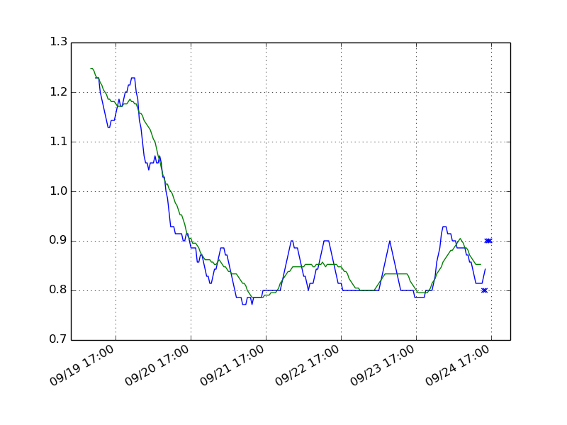
5. The Twin Axes
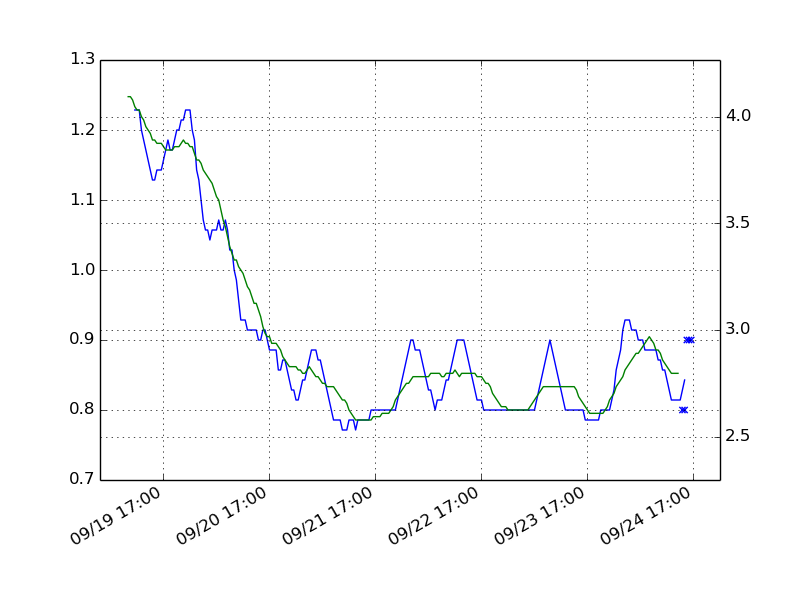 Now, people that I showed the graph to were not happy. Why was the wave height in meters? Nobody uses meters for waves! It’s all in feet!
I would imagine people outside the USA probably use meters to measure wave heights, but I was used to feet, too. I mean, the conversion is not hard, but why not. I was sure it wouldn’t be too hard!
Turns out it took forever to figure out. Again, the problem was not that matplotlib is not able to do it easily, it’s just that you have to figure out how to easily do the things you want to do.
I need to create a “twin axes.” This twin axes would be placed on the right (with the original one left on the opposing side). I could give it whatever minimum and maximum I wanted, and matplotlib would plot it without further ado.
y1, y2 = ax.get_ylim()
x1, x2 = ax.get_xlim()
ax2 = ax.twinx()
ax2.set_ylim(y1 * 3.2808399, y2 * 3.2808399)
ax2.set_xlim(x1, x2)
grid()
What I did here was to get the x and y limits of the old axes, then create the evil twin. Then I set the minimum and maxium of the twin. Notice how I used the name “axes,” although I wanted only the Y axis. That’s because to matplotlib, the axes object contains both axes. When I created my twin, I created a twin for both axes, so now I have to set the limits for both directions. By choosing the same limits for both x axes, I get a single tick display.
The conversion factor between meters and feet is (you guessed it) 3.2808399. By multiplying the old min and max by this factor, I get a new axis that scales automatically. Notice that I don’t have to tell matplotlib to format it nicely. It knows how to do that on its own.
6. Prettier Display
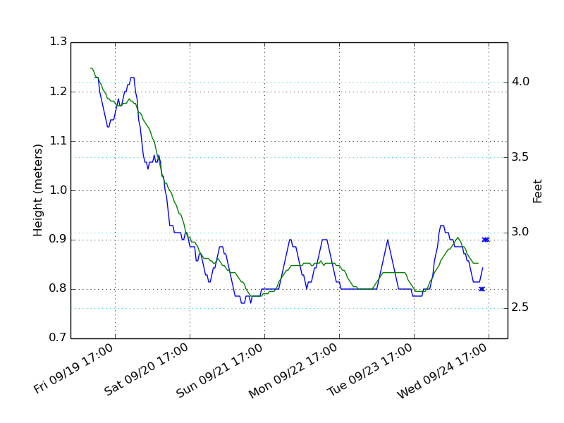 Now I wanted to add legends to explain the different axes. Also, I noticed that it would be useful to have the day of the week at the bottom, since my surf schedule depends (sadly) on my work schedule.
This was really, really easy to do. All it needed were a change to the date formatter, and two calls to set the legend.
The first one was just the addition of a single %a before %m/%s. %a is (for whatever reason) the UNIX standard for “day of the week.”
The function calls were:
ax.set_ylabel('Height (meters)')
ax2.set_ylabel('Feet')
grid(color='c')
Notice that they are set separately for the different axes. Also, I decided to change the color of the foot grid to cyan ‘c’, because there were way too many black grid lines on my graph.
7. Ephem
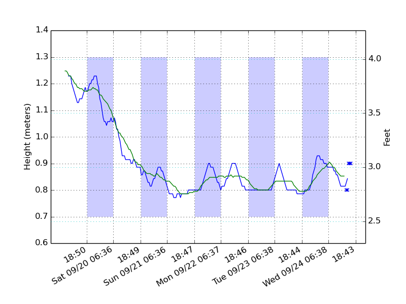 There was one big item remaining. I wanted to add the time of sunrise and sunset to the graph. After all, it doesn’t really matter how wonderful the waves were at night. Only daytime matters. Also: this would allow me to see immediately when it was time to get out, or to head back.
I checked the webs for libraries that did what I wanted – give me time of sunrise and sunset for a specific location. I stumbled about the non-standard ephem library. It is integrated enough that you can pip it, but it’s not in the Ubuntu repositories yet.
To install it, you download pip: sudo apt-get install python-pip
Then you install ephem: sudo pip install ephem
(That wasn’t too hard, was it?)
I also wanted some way to tell day from night. Turns out that matplotlib has a function, fill_between(), that allows you to shade the background where you’d like.
Armed with all of that,this is what I did. I started by adding new import statements:
import datetime
import ephem
import bisect
bisect is a library we’ll need later. It tells you between which items in a sorted list a new item would belong. Say you have the list [1, 3, 5, 7] and bisect with 4. Then you’d get a 2 back, because 4 belongs after the second element in the list.
Next we generate the location we need:
loc = ephem.Observer()
loc.lat = '32.930'
loc.lon = '-117.392'
loc.elev = 0
sun = ephem.Sun(loc)
The coordinates are those of the La Jolla buoy (the final version reads them from the NOAA page). We create a location (loc) with those coordinates and say we want the ephems for the celestial object Sun. From an ephemerides perspective, sunrise and sunset are just the rise and setting of the sun, just like that of any other celestial object.
Now the beef of the whole change:
mint=min(times[:i])
maxt=max(times[:i])
numdays = (maxt - mint).days
d = [mint + datetime.timedelta(days=dt) for dt in xrange(numdays+1)]
d.sort()
sunrise = map(lambda x:dates.date2num(loc.next_rising(sun,start=x).datetime()),d)
sunset = map(lambda x:dates.date2num(loc.next_setting(sun,start=x).datetime()),d)
ticks = sunrise + sunset
ticks.sort()
def is_night(t):
global sunrise, sunset
result = []
for st in t:
result.append(bisect.bisect(sunrise, dates.date2num(st)) != bisect.bisect(sunset, dates.date2num(st)))
return result
def sunriseset(x, y):
dt = dates.num2date(x, tz=tz.tzlocal())
if dt.hour < 12:
return dt.strftime('%a %m/%d %H:%M')
else:
return dt.strftime('%H:%M')
ax.xaxis.set_major_locator(matplotlib.ticker.FixedLocator(ticks))
ax.xaxis.set_major_formatter(matplotlib.ticker.FuncFormatter(sunriseset))
ax.fill_between(times[:i], min(heights[:i]), max(heights[:i]), where=is_night(times[:i]), facecolor='#CCCCFF', edgecolor='none')
OK, first we get the times of the oldest and newest reading (that is actually on the page). That’s mint and maxt. We need the number of days between the two, because we’ll have to generate sunrise and sunset data for each day. In fact, in the variable d we generate a point in time for every day (it’s the first data point, mint, plus one day each until we get to maxt).
Next we use the map function to generate a list of sunrises and sunsets. In particular, we ask for the next rising and setting of the sun after the date given.
We add the two lists together, because the sunrises and sunsets are going to be our ticks.
Now a trick. Since we know that we want to see the sunrises and sunsets we just computed as the major ticks on our graph, instead of using the automatic date formatter, we use a custom formatter and a custom locator. We simply tell matplotlib: these are the dates and times you are going to show.
For the formatter, I chose a custom formatter to make it easier to tell sunrise from sunset: if the time is before noon (sunrise) return the day and time. If it’s after noon, return only the time.
Finally, look at how I added the fill_between() function. It’s a bit unwiedly, because it wants to know when it should shade. In this case, I added a function that determined whether a point was during the day or the night by checking how many sunsets and sunrises had passed. If there were more sunrises than sunsets, then it was day. Otherwise night. (The way I did it, I realized, would reverse the logic at night. Since I don’t surf at night, this was not much of a concern.)
8. Final Comments
I added a few more things after sunrises and sunsets. Some were trivial (like a Title for the whole graph, which is simply set with the set_title function). Others required a little more work, like allowing for any buoy to be chosen for display.
The thing that stands out to me is that the original version did most of what I needed with only about 30 lines. If anyone asks me why I fell in love with Python, that’s the reason: the libraries are incredibly powerful and easy to use, with only a few exceptions in the core.
This is patently obvious when you look at a non-standard library like ephem. The functionality is great, but it’s strange that you can’t specify a location’s longitude and latitude immediately. Instead, you have to create the object, and then assign it latitude and longitude. It’s not a big deal, of course, but it shows that whoever wrote the code didn’t think about how people would likely use it.
Please let me know (PM me or leave a comment) if you want the whole script.